Code
This code is for the images of soda cans that bounce up and down when hovered on. This is a neat use of the animation effect—it kind of shouts "pick me!" to the user and lets them know which product they are hovering over. If you inspect the image and change the state to running, you can see the bounce effect in action. Another cool way to observe this code is to open all the elements in the div class, then hover over each soda can to see the active animation events.
UI
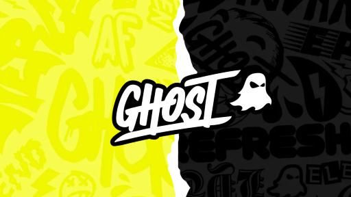
When you arrive at the page, you have the option between Energy and Hydration. When you hover over each side, there is an effect over the words "Energy" and "Hydration," and the background on each side changes to reflect a different product. This adds a playful element to the selection process.
UX
While I appreciate the colors, styles, and overall ease of use, I feel there is a slight lack in user experience. I should be shown the products first and then allowed to scroll for a marketing video.
Summary
There are some cool elements on the page, but the user experience is slightly lacking. When I selected the energy page, I had to scroll to find the product lineup. There is even another page to go to for the full product list. I believe it should have gone product-first, then marketing video—I was already on the page looking for a product.